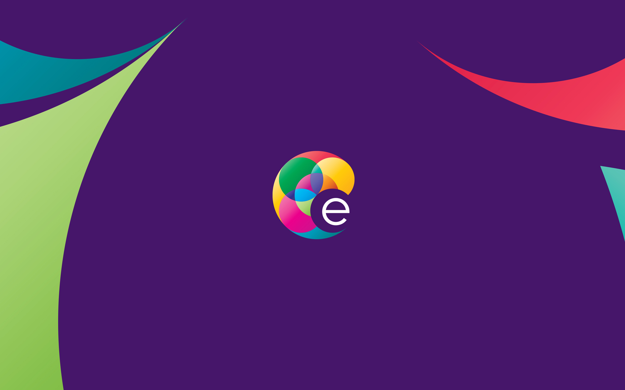
Subject of research / production of the visual communication design/branding: Etherland is a fast expanding web-hosting provider comprised of talented developers, network admins, linux admins, unix admins and much more, holding on to their roots as a company who invests everything into their dedicated customers. Basic characteristics taken under consideration: youthful essence, the future of communication, advanced technology, universal interconnection.
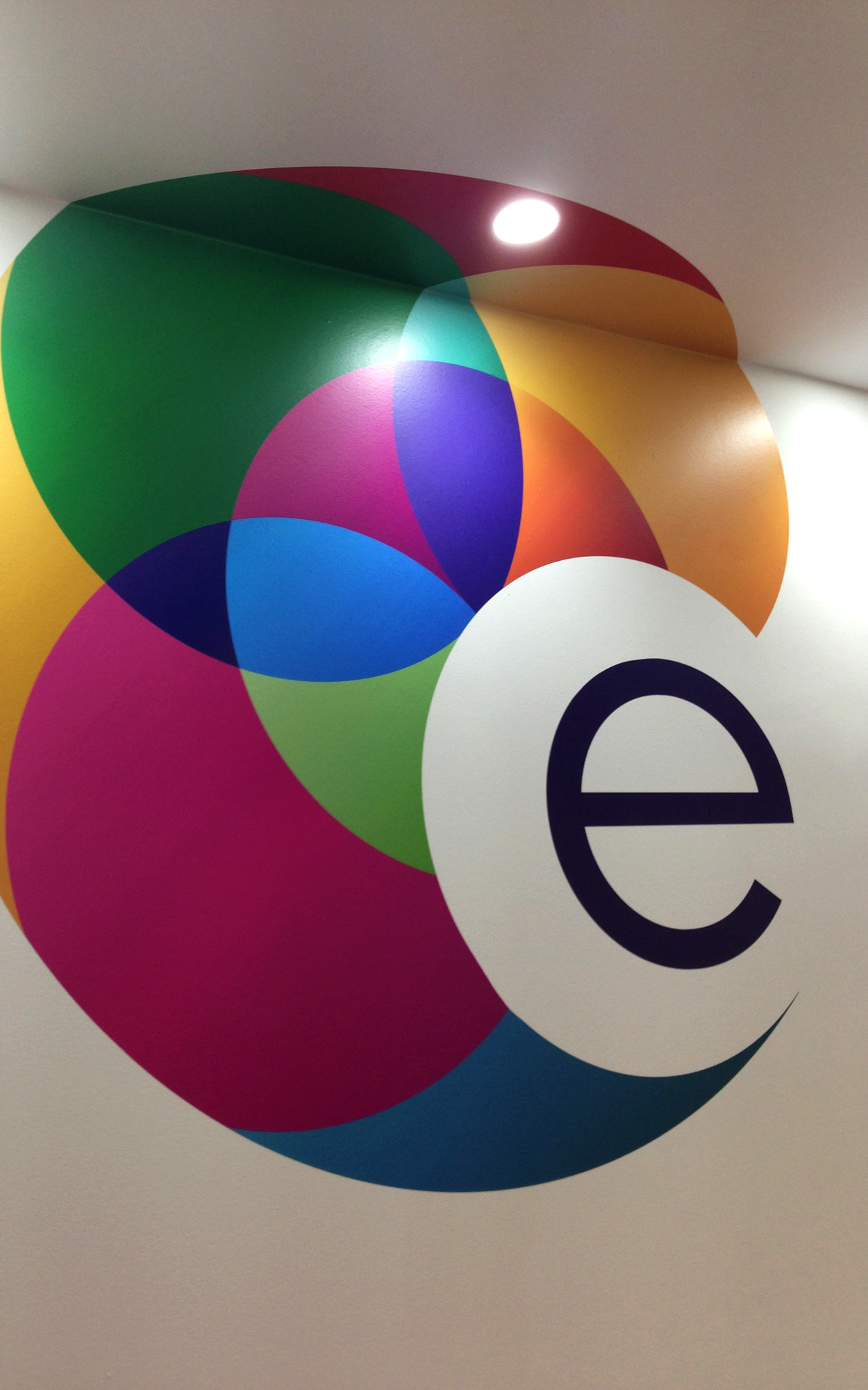
The 8 different fluo colors represent the 8 large landmasses on Earth. Those link the world’s continents as the social communication grows in interconnected circles. The initial letter E, can be used separately as a logo in digital format.